Your planning committee spent two hours debating theme names. Someone pitched “Roaring ’20s Speakeasy,” everyone loved it, and the vote was unanimous. Fast forward to event day: the keynote speaker shows up in a standard suit, half the attendees ignored the dress code suggestion, and the themed decor looks like a cluttered ballroom with some feather boas draped over signage. The theme existed in a slide deck and on a banner behind the registration table. Nowhere else.
This is the most common way fun conference themes fail. Not because the idea was bad, but because nobody carried it past the brainstorm. A theme only delivers energy and memorability when it shows up everywhere: the registration page, the badge in your hand, the emcee’s opening line, the social conversation afterward. Pick the wrong theme or execute the right one halfway, and you’ve spent budget on decoration that attendees forget by lunch.
Why a strong theme changes how attendees experience your conference
A conference theme isn’t decor. It’s a conceptual frame that unifies session titles, marketing copy, badge design, and on-site visuals under a single narrative. When a theme works, attendees feel it before they arrive, in the confirmation email, in the branded registration page, in the social media teasers that build anticipation. When it doesn’t work, they see a banner and shrug.
The difference between those two outcomes is almost always timing. If the theme isn’t locked four to six months before the event, it won’t make it into the registration flow, the email sequence, or the printed materials. Attendees arrive with zero context. The “fun” element falls flat because nobody primed them to expect it.
Experiential marketing investment continues to climb across industries, with a growing share of event budgets shifting toward attendee experience rather than raw content delivery. Industry data consistently shows the majority of marketers increasing experiential spend year over year, a signal that attendee experience, not just content quality, now drives perceived event value. That trend rewards organizers who treat theme selection as a strategic decision, not a last-minute creative exercise.
The most durable conference themes in higher ed and professional association events aren’t purely aesthetic. They’re conceptual frames that give session titles somewhere to live. A theme like “Navigating Uncharted Territory” lets a nursing CEU conference brand its breakout tracks, its printed program, and its certificate language around a single idea, without requiring a costume budget. That’s the kind of theme that scales across touchpoints without ballooning your line items. It’s also the kind of theme that supports building a cohesive event brand rather than fighting against one.
How to pick a theme that fits your audience and goals
Before you browse any list, answer three questions. They’ll filter out themes that sound clever in a meeting but collapse on the event floor.
First: what is the single takeaway you want attendees to remember? If your annual conference is about navigating AI adoption, a space-exploration theme reinforces that message. A tropical-luau theme contradicts it. The theme should amplify your content, not compete with it.
Second: what’s the professional context? Government and healthcare conferences need themes where levity coexists with seriousness. Aspirational or metaphor-based themes work. Costume themes usually don’t; a room full of federal agency employees isn’t dressing up as astronauts. Association annual meetings and internal corporate events can lean more playful because the audience already shares social norms.
Third: what’s your production budget for decor, signage, and swag? A theme that requires full venue transformation costs five to ten times more than one that relies on digital branding, badge design, and emcee scripting. Know your tier before you fall in love with an idea you can’t execute.
Inclusivity and cultural sensitivity
Avoid themes that lean on cultural stereotypes. “Around the World” sounds harmless until the decor reduces entire cultures to table centerpieces. Test pop-culture references for cross-generational and cross-cultural resonance, especially for international conferences where humor may not translate.
Sensory elements matter too. Fog machines, strobe lighting, and loud music can exclude neurodivergent attendees. If your theme calls for immersive sensory elements, designate a quiet zone and communicate what to expect in pre-event emails.
One practical move: send a quick three-option poll to your registration list or past attendees before committing budget. You’ll learn fast whether your audience wants “Game On” energy or “Seeds of Change” gravitas. A ten-question survey kills momentum, but a single-question vote takes thirty seconds and gives your committee real data instead of gut feelings.
30+ fun conference themes organized by goal
A flat list of theme names is easy to skim and impossible to act on. Each theme below is paired with an implementation note describing what it is designed to accomplish and how it shapes the event experience.
The themes below are organized into five goal-based categories, each paired with a brief implementation note, a direction for how the theme influences session naming, decor, or attendee interaction. Use these as starting points, not final answers. Swap words, combine ideas, and adapt to your audience. If you’re planning your full event from scratch, lock the theme early so it can shape every downstream decision.

Innovation and future-focus themes
These work best when your conference content centers on emerging trends, technology adoption, or forward-looking strategy. AI and future-of-work themes are especially timely given growing institutional focus on AI competencies across industries.
Mission Control, Name session rooms after historic space missions (Apollo, Artemis, Voyager). Use a countdown clock on the main stage between speakers. Badges can feature a mission-patch design. Works in virtual formats with a “launch sequence” lobby animation.
The Next Frontier, Frame keynotes as “expeditions” and breakout sessions as “field reports.” Topographic or star-chart visuals on signage. Translates well to hybrid events with branded Zoom backgrounds featuring frontier landscapes.
Code the Future, Best for tech-adjacent audiences. Use monospace fonts and terminal-style green-on-black design elements. Session tracks become “modules.” Digital badge designs carry this theme naturally into virtual formats.
Blueprint 2030, Architectural blueprint visuals on signage and programs. Session titles frame ideas as “designs” or “plans.” Works well for strategic planning conferences where attendees are literally building a roadmap.
Signals and Noise, A strong fit for data-heavy or research conferences. Frame keynotes as “signals” and interactive workshops as “tuning sessions.” Waveform graphics on badges and programs. The metaphor gives speakers a natural hook for distinguishing important trends from distractions.
The Innovation Lab, Set up the main hall like a lab environment with whiteboards, prototyping stations, and idea boards. Session rooms become “labs.” This theme demands at least one hands-on workshop to feel authentic. Without that, it’s just a name.
Ctrl+Alt+Create, Playful enough for creative industries, structured enough for corporate events. Use keyboard-key graphics on badges. Session tracks become “shortcuts.” Translates easily to virtual with branded desktop-themed backgrounds.
Prototype, Frame the entire conference as a draft, a place to test ideas before they’re finished. Encourage speakers to present work-in-progress rather than polished case studies. This theme gives permission to be experimental, which changes the energy in the room.
Resilience and growth themes
Resilience themes resonate particularly well for industries that have weathered disruption: healthcare, education, hospitality. They give keynote speakers a natural narrative arc: What broke, what we built from it.
Rising Stronger, Sunrise or mountain-summit visuals. The opening session is “The Ascent” and the closing session is “The Summit.” Simple, versatile, and works across sectors without feeling generic.
Seeds of Change, Botanical or garden visuals on signage. Session tracks become “growth paths.” This theme pairs well with sustainability-focused content. Distribute seed packets as swag, low cost, high memorability.
The Comeback, Sports-inflected language without requiring sports content. Keynotes are “halftime talks,” breakouts are “plays.” Works best for audiences comfortable with competitive metaphors.
Unbreakable, Bold, high-contrast design elements. Works for crisis-response or change-management conferences. The tone is serious but empowering. Pair with speaker stories of organizational resilience.
From the Ground Up, Construction and foundation metaphors. Session rooms named after building materials or architectural elements. Strong fit for conferences about rebuilding programs, departments, or systems.
Second Wind, Endurance-race imagery. Frame the conference schedule as “miles” or “legs.” Works well for multi-day events where energy management is a real concern. The afternoon keynote becomes the “second wind session.”
Roots and Branches, Tree imagery on programs and signage. Foundational sessions are “roots,” advanced sessions are “branches.” This theme scales beautifully for conferences with multiple experience levels in the audience.
Unity and collaboration themes
Collaboration themes pair naturally with interactive session formats, fishbowl discussions, world café rotations, and collaborative problem-solving workshops. If your agenda is mostly lecture-style, these themes will feel hollow.
Better Together, Simple, warm, and universally understood. Works across cultures and industries. Badge design can feature puzzle-piece or mosaic elements. The closing session is “The Full Picture.”
The Hive Mind, Honeycomb visuals on signage and programs. Session rooms named after roles in a hive (The Queen’s Chamber, The Waggle Room). Playful enough for association events, structured enough for corporate ones.
Bridges Not Walls, Bridge imagery and architectural photography on signage. Strong fit for conferences about cross-departmental collaboration, interdisciplinary work, or community building. Session tracks become “spans.”
All Hands In, Handprint or hand-illustration design elements. Interactive sessions where attendees contribute to a collective output, a mural, a shared document, a collaborative playlist. The theme demands participation to work.
The Collective, Minimalist, modern design. Works well for creative industries and nonprofit conferences. Frame keynotes as “collective conversations” and breakouts as “working groups.” Translates cleanly to virtual with collaborative digital whiteboards.
Stronger in Numbers, Data-visualization-style graphics on signage. Works particularly well for conferences that present research or aggregate data. The theme reinforces the value of the community itself.
Adventure and exploration themes
Exploration themes are among the most versatile for professional conferences. They imply ambition without requiring costumes. Session tracks become “trails,” the agenda becomes a “map,” and badges can feature compass or topographic design elements.
Navigating Uncharted Territory, The gold standard for conceptual themes. Works for any industry facing uncertainty or change. Session rooms named after famous explorers or geographic features. Compass-rose badge design. Translates to virtual with map-themed lobby screens.
Expedition [Year], Replace the year with your event year. Frame the conference as a journey with a departure point and a destination. The opening session is “Base Camp” and the closing is “Summit.” Multi-day events can name each day as a “leg” of the expedition.
Trailblazers, Celebrate pioneers in your field. Name awards or recognition moments after historical trailblazers relevant to your industry. Trail-marker signage throughout the venue. Works well for conferences honoring legacy and innovation simultaneously.
The Deep Dive, Ocean or underwater visuals. Session tracks become “depths” (Surface Level, Mid-Water, The Deep End). Strong fit for research conferences or technical deep-dives. Branded Zoom backgrounds with underwater scenes work surprisingly well for virtual.
Off the Map, Frame the conference as exploring ideas that don’t have established playbooks yet. Vintage cartography on signage. “Here Be Dragons” zones for unconventional breakout sessions. This theme gives speakers permission to speculate.
Base Camp, Position the conference as preparation for what’s next. The entire event is framed as equipping attendees for a challenge ahead. Gear-and-mountain visuals. Works best when paired with actionable takeaways and toolkits.
Compass Points, Four session tracks, four directions. North is leadership, South is foundations, East is innovation, West is reflection. The structure itself becomes the theme. Attendees navigate by direction rather than track number.
Lighthearted and pop-culture themes
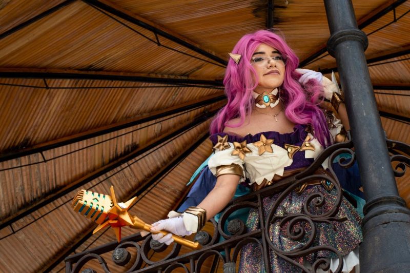
Pop-culture themes carry the highest risk of falling flat if not fully committed to. The themes that generate the most pre-event excitement are often the ones that disappoint most on-site, because the execution doesn’t match the promise.
These themes need a designated owner, one person who enforces the theme across every touchpoint. Registration page, signage, emcee script, badge design, photo ops. Without that single point of accountability, the theme reads as an afterthought.
Game On, Arcade or board-game visuals. Session rooms named after classic games. A leaderboard in the main hall tracking gamification points. This theme practically requires interactive elements to work, trivia between sessions, a prize wheel in the expo hall, team-based challenges.
Retro Rewind, Pick a decade and commit. ’80s neon, ’90s grunge, or Y2K nostalgia. The risk is half-measures: a few streamers and a playlist don’t make a theme. The emcee needs to be in character. The badge design needs to match the era.
The Great Remix, Frame the conference as remixing old ideas into new ones. Music-production visuals, equalizer bars, turntable graphics, track listings as session schedules. Works for creative and marketing conferences.
Plot Twist, Frame each keynote reveal or announcement as a “plot twist.” Movie-script visuals on signage. The emcee teases upcoming sessions like movie trailers. Fun for conferences with product launches or major announcements.
Blockbuster, Movie-premiere energy. Red carpet at the entrance. Session descriptions written like movie synopses. “Now Showing” signs outside session rooms. Popcorn at the snack stations. High commitment required, but memorable when done right.
Level Up, Video-game progression metaphor. Attendees “level up” by attending sessions, completing challenges, or visiting sponsor booths. Progress bars on badges or in the event app. This theme is hollow without actual gamification mechanics behind it.
The Roaring Revival, A nod to the 1920s without requiring full costume commitment. Art deco design elements, jazz playlist during transitions, gold-and-black color palette. Frame it as a revival of big ideas rather than a costume party, and it works for professional audiences.
Conference Tracker
Check people in fast. Prove they were there.
Conference Tracker scans attendees with the phones your staff already carry, tracks time in every session, and issues certificates and CEU transcripts on its own. One conference ran 2,623 attendees across 186 sessions on it.
30+ years building attendance tracking for events and education

The execution playbook: embedding your theme across every touchpoint
A theme that lives only on a banner is decoration. A theme that lives across eight touchpoints is an experience. The difference comes down to a chronological sequence of decisions, each one locking the theme into a new layer of the attendee journey.
- Registration website and landing page, This is where the theme makes its first impression. A branded landing page with theme-specific visuals, color palette, and copy primes attendees to engage before they arrive. If your registration page looks generic, you’ve already lost momentum. Conference Tracker’s custom branded registration pages let you carry theme visuals and language into the sign-up flow itself, so the theme starts working the moment someone registers.
- Confirmation and reminder emails, Every automated email is a theme touchpoint. Subject lines, header images, and copy should reflect the theme language. “Your Expedition Awaits” hits differently than “Registration Confirmed.”
- Social media teasers, Release theme-branded countdown posts, speaker announcements styled in the theme’s visual language, and shareable graphics attendees can repost. This builds anticipation and normalizes the theme before anyone walks through the door.
- Printed program and signage, Session track names, room names, and wayfinding signage should all use theme language. A printed program that ignores the theme creates cognitive dissonance for attendees who were primed by the registration page.
- Badge design, The badge is the one physical artifact every attendee carries all day. Theme-specific colors, icons, or language on the badge reinforce the theme at every glance and every networking exchange.
- Emcee scripts and session introductions, Brief the emcee on theme language. Every session introduction should use one or two theme-specific phrases. This is where themes either come alive or get quietly abandoned.
- Interactive on-site moments, This is where passive themes become active participation. A prize wheel in the expo hall, trivia questions tied to the theme between sessions, raffles that reward themed engagement. Conference Tracker’s built-in gamification features, including prize wheels, trivia, and raffles, run directly through the event platform, so participation data feeds into your analytics rather than living on a separate spreadsheet.
- Post-event communications and certificates, The theme should echo in thank-you emails, certificates, and survey invitations. An “Expedition Complete” certificate carries more weight than a generic PDF.
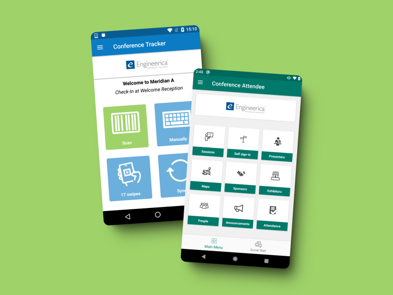
A social wall where attendees share themed photos creates a feedback loop that’s hard to replicate with any other tactic. When attendees see others posting themed selfies and group shots, participation normalizes. The theme becomes something people do, not just something they see. Conference Tracker’s social wall displays these posts in real time on screens throughout the venue, keeping the theme’s energy visible all day and extending its reach beyond the room through attendees’ own social channels.
For more tactics on keeping energy high throughout the day, see our guide on boosting attendee engagement.
Budget-conscious theme execution
Not every theme needs a venue transformation. But every theme needs intentional budget allocation, and rising costs make that allocation harder to ignore.
Think in three tiers instead.
Low-cost themes rely on digital branding, badge design, and emcee scripting rather than physical decor. Exploration and conceptual themes fit here. You’re spending on design time, not materials. A “Navigating Uncharted Territory” theme needs a compass-rose badge template, themed email headers, and a briefed emcee. Total incremental cost beyond your normal event budget: minimal.
Mid-range themes add printed signage, a photo backdrop, and one interactive element, a prize wheel, a trivia station, or a social wall display. This is the sweet spot for most professional conferences. You get visible theme presence without a decor vendor.
High-investment themes include full venue transformation, custom swag, and immersive decor. These work for flagship annual events with sponsor support. They don’t work for quarterly meetings.
The specific trade-off most organizers get wrong: spending on a single high-impact visual anchor, a 10-foot themed backdrop for the main stage, delivers more perceived production value than spreading the same budget across twenty small table centerpieces. Attendees photograph the backdrop. Nobody photographs the centerpieces. For a deeper look at allocating across categories, check out our guide on managing your event budget.
Adapting themes for hybrid and virtual conferences
The specific failure mode of hybrid theme execution is a two-tier experience. In-person attendees get the full sensory environment, signage, decor, photo ops, ambient music. Virtual attendees see a generic video grid. The theme must translate to both channels, or you’ve created two different events under one name.
Start with what virtual attendees actually see and interact with. Themed Zoom backgrounds distributed before the event give remote attendees a visual connection to the theme. A branded virtual lobby with theme-specific visuals replaces the generic “waiting room” experience. Digital badge designs that carry the theme’s color palette show up in every chat window and networking interaction.
Interactive elements like trivia and polls can run simultaneously for in-person and virtual audiences through your event platform. When both groups compete on the same leaderboard, the theme bridges the physical-virtual divide instead of reinforcing it.
Conceptual and aspirational themes, exploration, innovation, growth, adapt to virtual formats far more easily than decor-heavy themes. “The Deep Dive” works with an underwater Zoom background. “Roaring ’20s Speakeasy” doesn’t work without the physical speakeasy. If you’re running a hybrid event, weight your theme selection toward concepts that translate through a screen.
Measuring whether your theme actually worked
Most organizers evaluate themes by gut feel: “People seemed to like it.” That’s not measurement. Three signals give you actual data.
Registration conversion rate compared to previous events tells you whether the theme drove sign-ups. If your themed landing page converted at a higher rate than last year’s generic page, the theme earned its keep at the marketing stage.
On-site engagement metrics, session check-in rates, gamification participation counts, social wall post volume, tell you whether the theme translated to behavior. Real-time attendance dashboards let you see which themed sessions draw the highest check-ins, giving you data for next year’s theme selection instead of anecdotal impressions. If your “Innovation Lab” breakout sessions had 40% higher attendance than your standard-titled sessions, the theme language did real work.
Post-event survey scores isolate theme impact from general satisfaction. Include two to three theme-specific questions: “Did the theme make the event more memorable?” and “Would you attend a future event with a similar theme?” These questions separate theme value from speaker quality, venue quality, and content relevance. For guidance on structuring those questions, see our resource on writing effective survey questions.
The combination of these three data points, pre-event conversion, on-site behavior, and post-event perception, gives you a defensible answer when your committee asks whether the theme was worth the investment.
Lock next year’s theme during the debrief
The best time to choose your next conference theme isn’t six months out. It’s during the post-event debrief, when feedback is fresh and the team can articulate what resonated and what fell flat.
A fun conference theme earns its name when it shapes decisions, not just decorations. The theme that shows up on your registration page, in your emcee’s opening line, on every badge, and in the post-event certificate isn’t decoration, it’s the event’s identity. The theme that only shows up on a banner is a missed opportunity you paid for.
Start your next debrief with one question: “If we had to describe this year’s event in three words, what would attendees say?” If those three words match your theme, you executed. If they don’t, you have your starting point for next year, and the playbook above to make it stick.